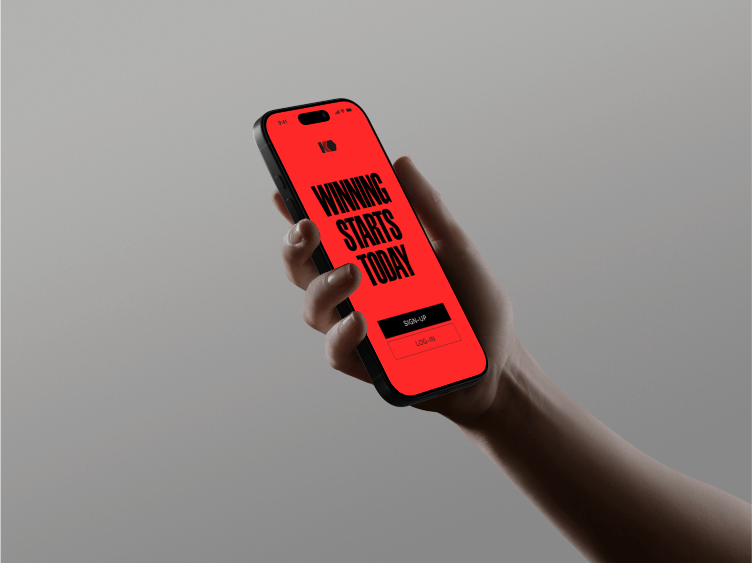
KO-REDESIGN
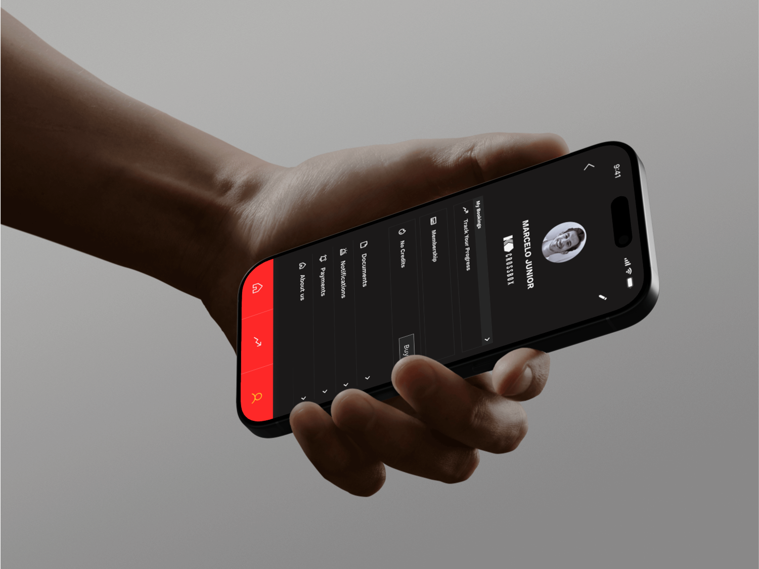
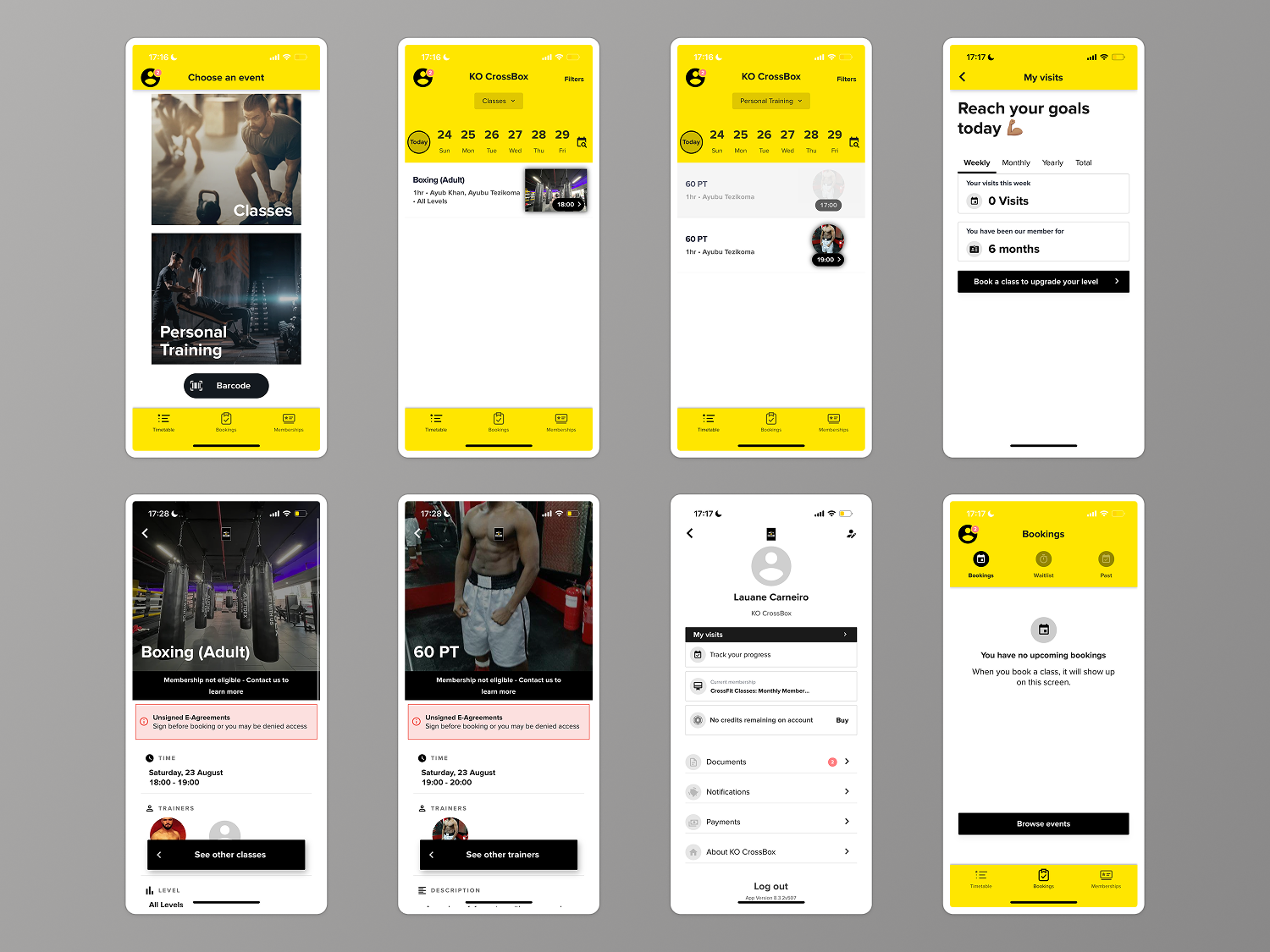
KO is a gym app redesign focused on faster class booking, clear navigation, and visible progress, wrapped in a bold black–red–yellow identity.
My Role: UI/UX · Prototyping
Collaborators: Gabriel Damasio Visual Identity · Wireframing
Focus: UX Design · UI Design · Mobile
Overview
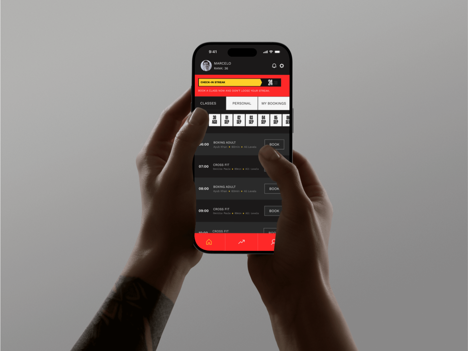
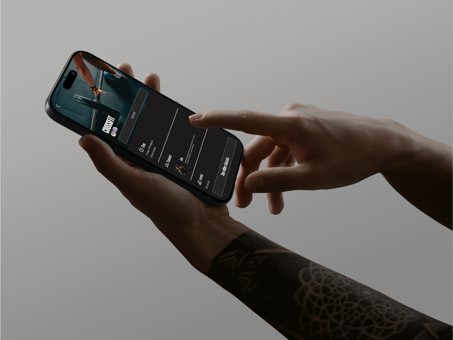
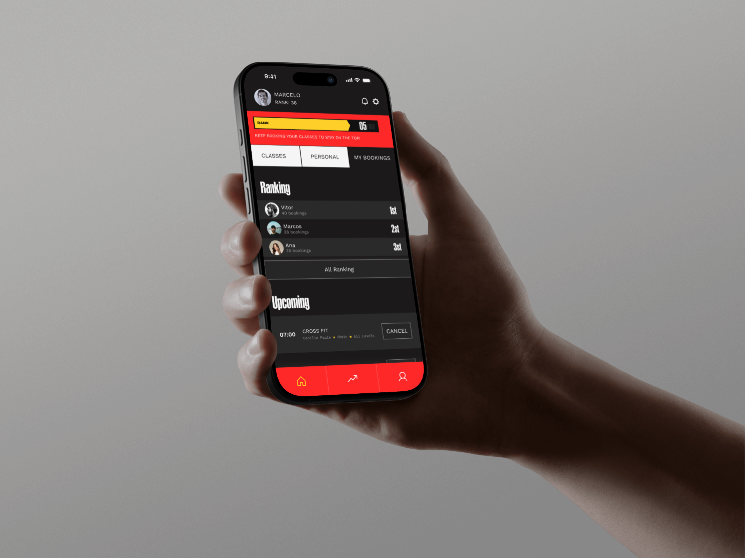
KO reframes the experience around the user’s core jobs: discover classes, book in seconds, track progress, and schedule personal training. Built collaboratively as a personal project, I owned key UI flows, component variants, microinteractions, and delivered dev-ready handoffs (tokens, states, spacing, interaction notes).
Problem & Goal
Existing flows felt slow and uncertain users struggled to find classes, understand availability/rules, and confirm bookings.
Goal: Preserve utility-level speed and clarity while adding confidence and momentum without adding friction to core tasks.
Goal: Preserve utility-level speed and clarity while adding confidence and momentum without adding friction to core tasks.
Before the redesign
Undefined flow, cluttered UI, weak branding → more friction and lower booking adoption.
Made with ❤︎ in 2025
